Reducing support requests by redesigning error states
1 in 4 users hit a failure in the core flow. Most never recovered. An analytics-driven redesign of error states, guidance, and station eligibility filtering.
Role: Product Designer - UX Research
Period: April 2026
Platform: iOS · Android
Sample: ~52,000 users · 10 days
- 52K — users analyzed across iOS and Android
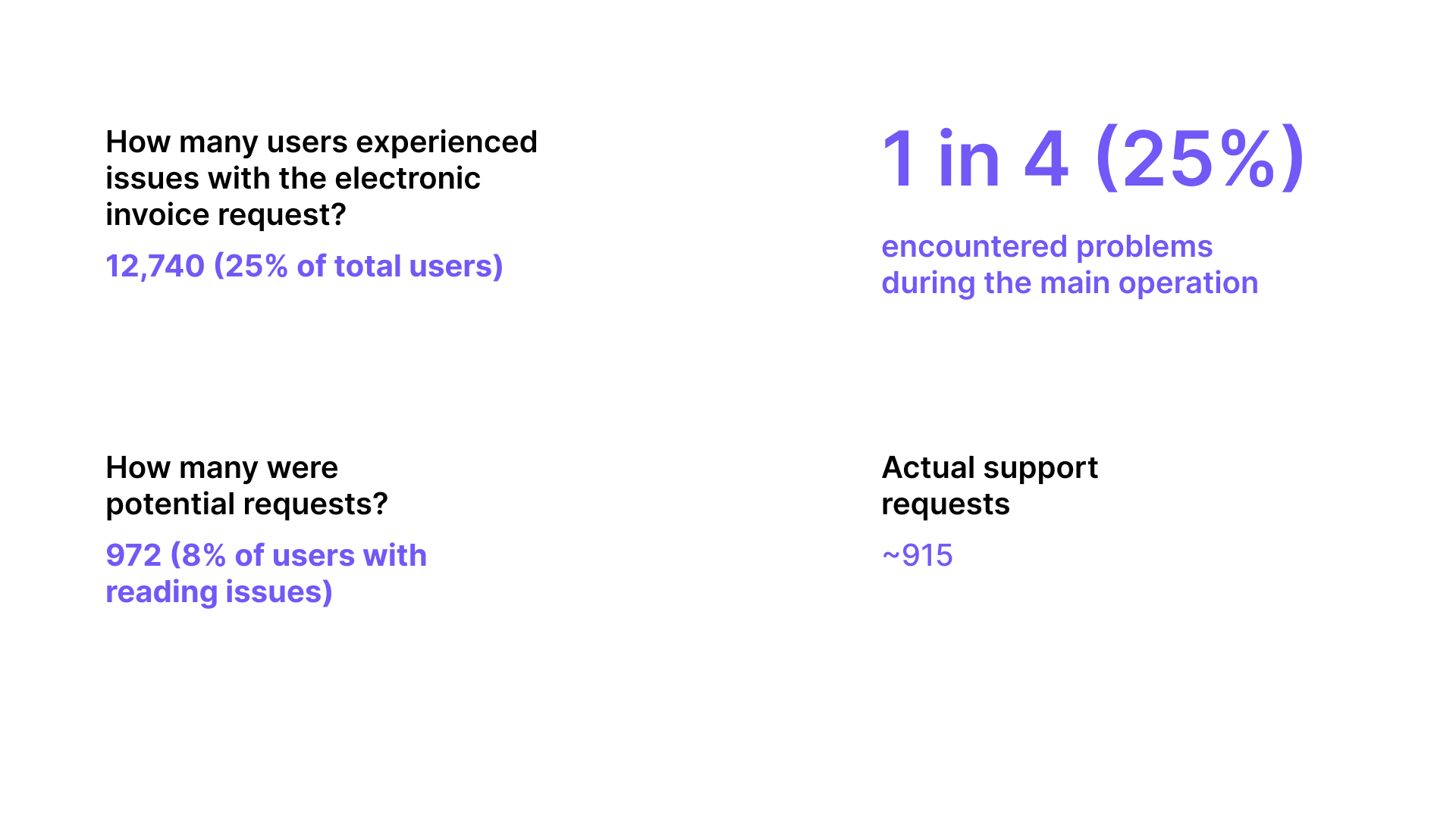
- 25% — encountered a failure in the main flow
- ~915 — support tickets generated in 10 days
- 80% — abandoned the flow after the first error
#1 - The core feature wasn't working for 1 in 4 users
Fattura 1 Click is the primary feature of the Eni Station app — it lets drivers request an electronic invoice directly after refueling by scanning their receipt. It's not a secondary feature. It's the reason a significant portion of users download the app.
The support team was receiving a high volume of tickets, but no one had mapped exactly where in the flow users were breaking down, or why. We ran a 10-day behavioral analytics study on ~52,000 active users across iOS and Android to find out whether this was a technical problem, a communication problem, or a design problem.
It turned out to be all three — but mostly design.
Projected monthly, the ~915 tickets in 10 days translate to roughly 2,700 per month — each requiring 5 to 10 minutes of agent time. More importantly, every abandoned flow was a failed product experience for a user who had a legitimate need.
#2 - The drop-off was catastrophic at the first error
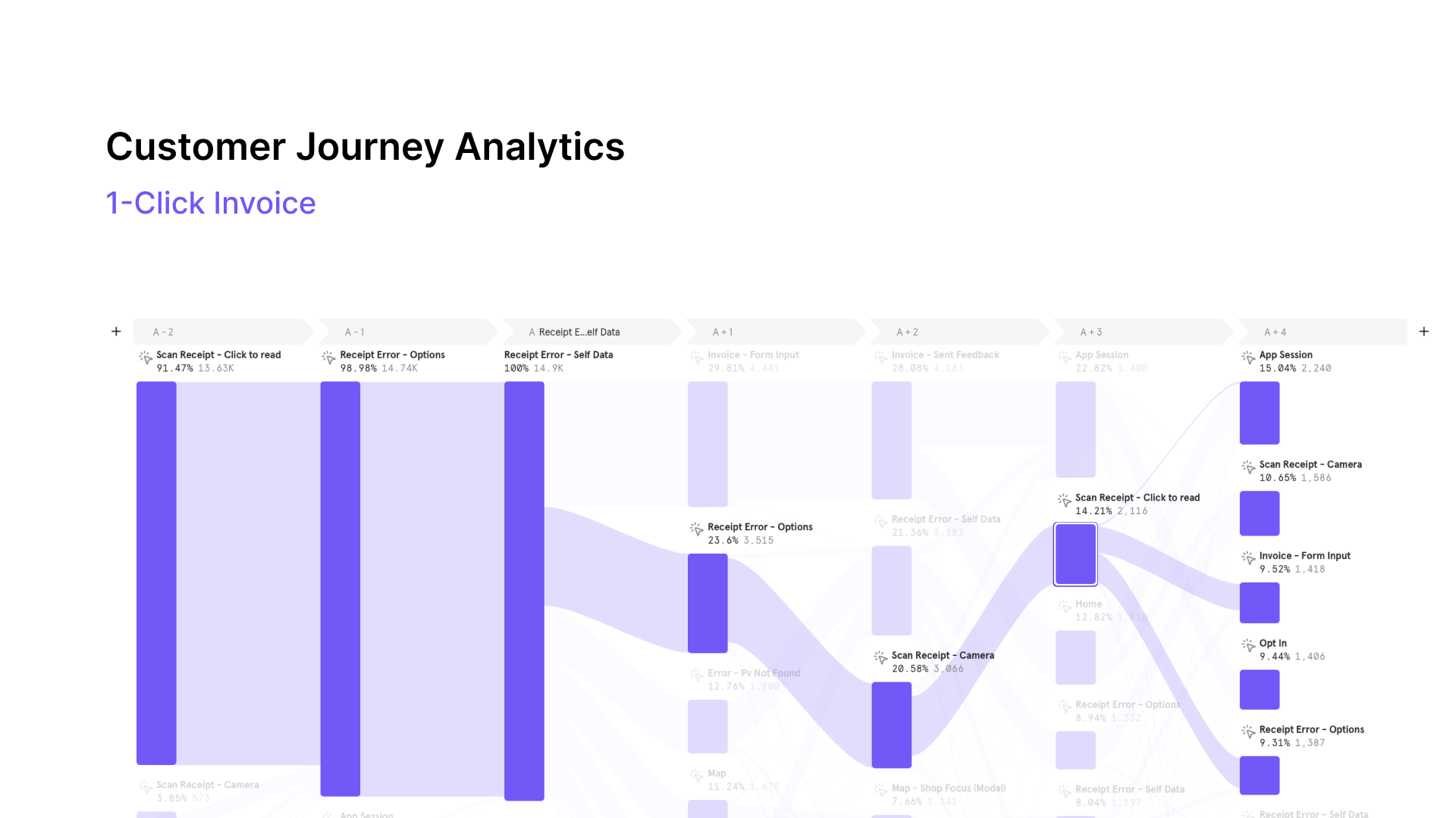
The customer journey map showed a clear pattern: the flow functioned well until the receipt scan step. Once a user hit a receipt error, recovery was nearly impossible — not because the app offered no path forward, but because the paths it offered were confusing, incomplete, or led immediately to a support request.
Drop-off chain
- Scan Receipt → 14,900 users (100%)
- Receipt Error — Self Data → 100% hit error state
- Invoice Form Input → 29.8% (4,445 users)
- Invoice Sent → 28% (success)
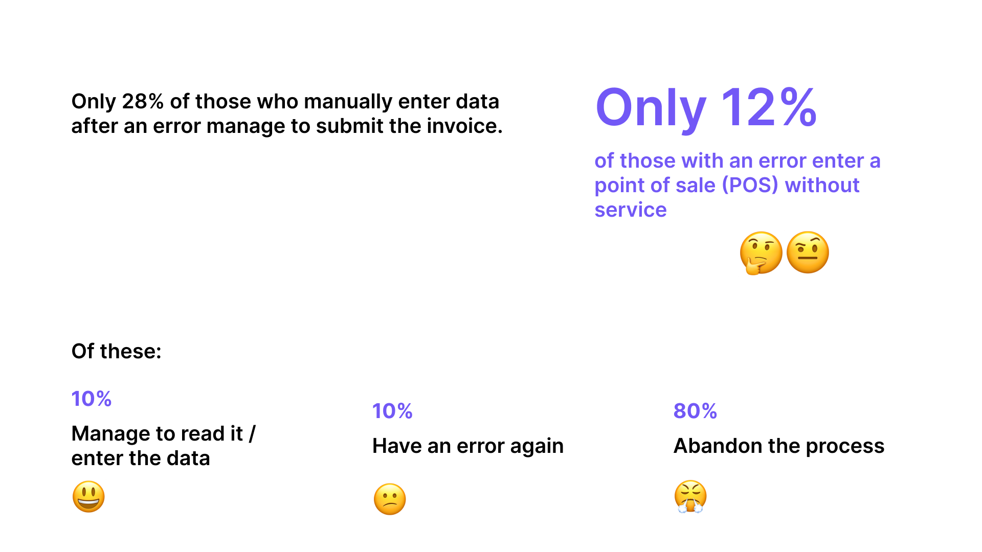
Of users who tried to manually enter their data after a receipt error, only 28% successfully sent the invoice. The other 72% either hit another error or gave up.
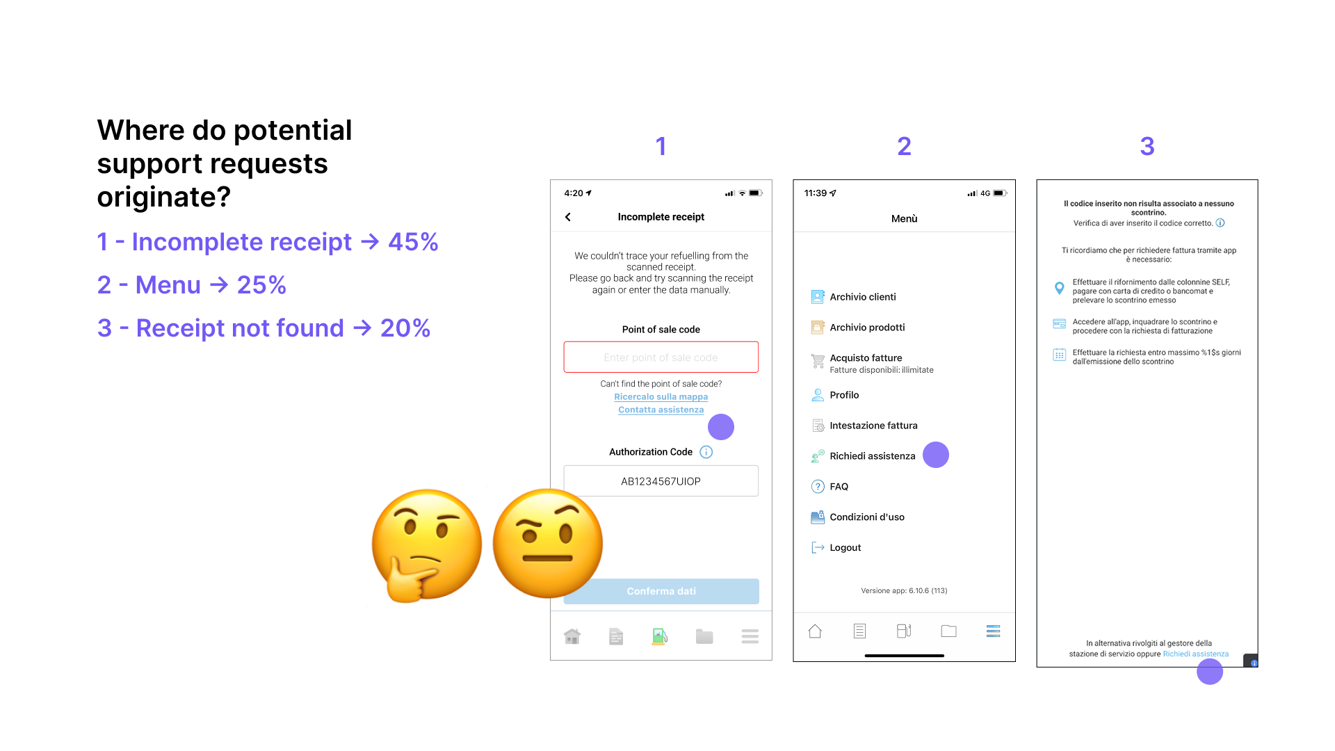
Where support requests originated
- Scontrino non completo → 45% — scan succeeded but data was unresolvable
- Menu (navigated to support directly) → 25% — bypassed the flow entirely
- Scontrino non trovato → 20% — system couldn't locate the receipt at all
#3 - Root causes
The data pointed to three distinct and addressable root causes. Each was generating a disproportionate share of tickets and could be resolved without changing backend logic.
ROOT CAUSE 01
Support was too easy to reach
Data:
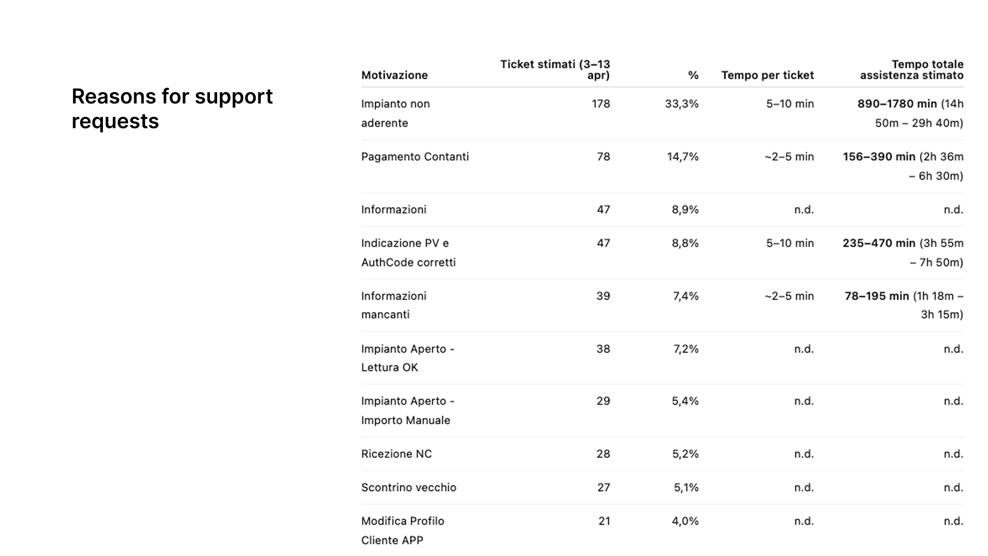
- 33.3% of all tickets — impianto non aderente
- 178 tickets in 10 days
- 890–1,780 min total support time consumed
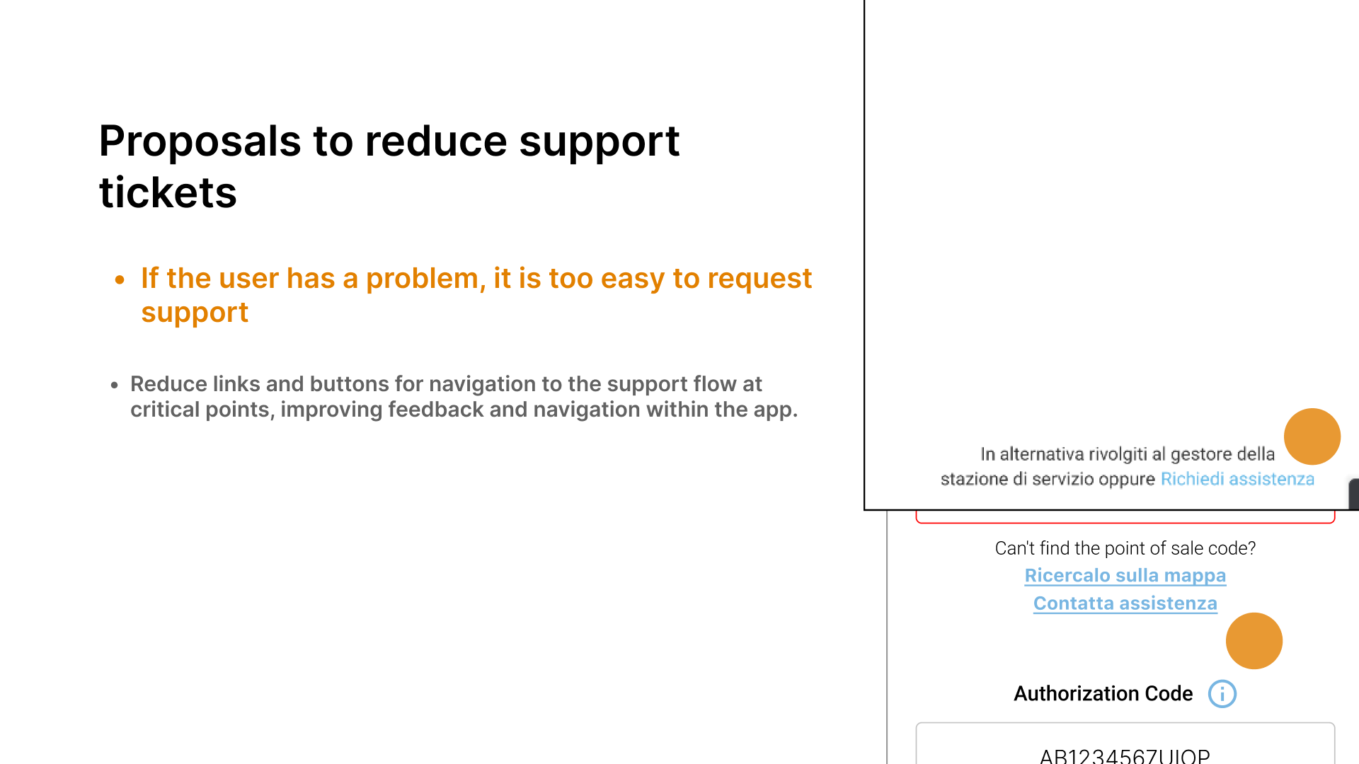
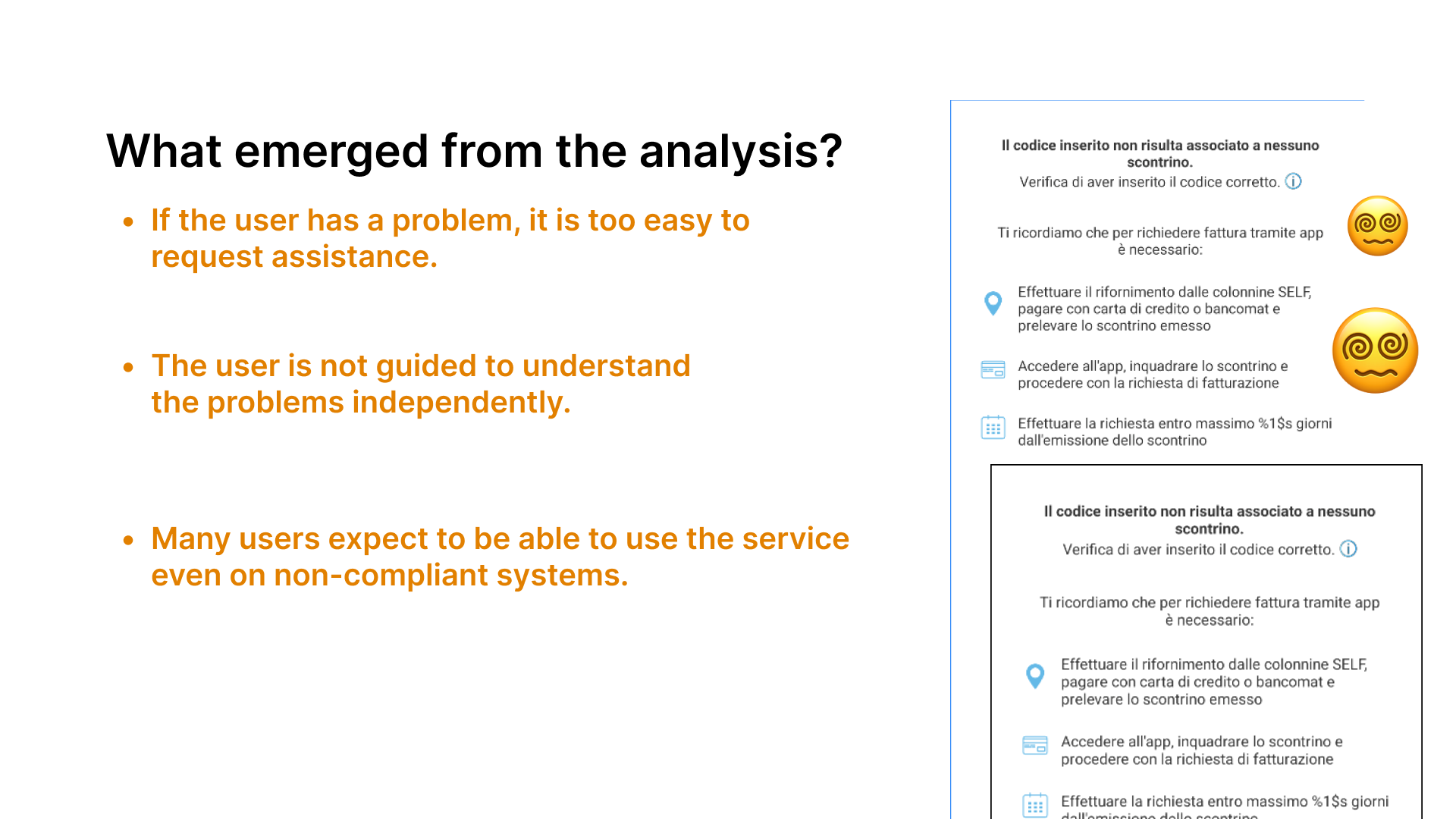
At every critical failure point — receipt scan error, PV not found, authorization code mismatch — the UI prominently displayed a "Contatta assistenza" button. The intent was to help. The effect was to short-circuit any attempt at self-resolution.
Users who hit an error saw three things: a verbose explanation of what went wrong, two links to try to fix it themselves, and a large, visually prominent support CTA. Most clicked the CTA. The self-help options were there — they just weren't being chosen.
The paradox: making support easier to reach was generating more support requests, not fewer. Users weren't asking for help because they needed it — they were asking because the design suggested they should.
ROOT CAUSE 02
Errors explained what happened, not what to do
Data:
- 80% abandoned after the first error
- 28% success rate on manual data entry
- 72% failed again or gave up entirely
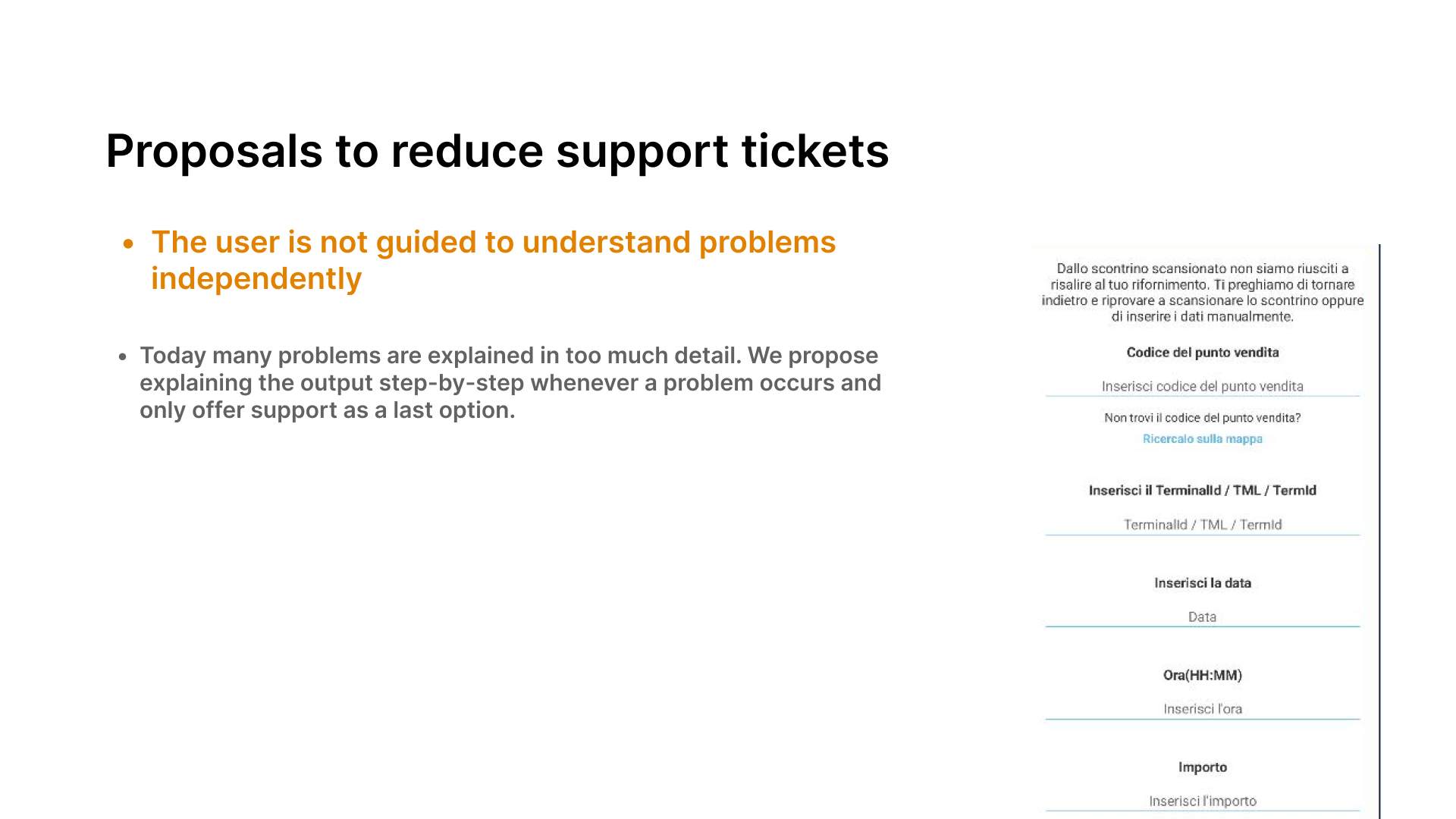
When a receipt scan failed, the error screen presented a dense explanation of the technical failure, followed by a form asking users to manually enter their PV code, authorization code, terminal ID, date, time, and amount — all in one screen, with no step-by-step guidance.
Users weren't failing because the task was impossible. They were failing because the interface treated a high-cognitive-load recovery task as if it were self-evident. The form was designed for a user who already understood the system — not for someone in a parking lot, frustrated that their scan didn't work.
The solution wasn't simplification for its own sake — it was progressive disclosure. Show one problem at a time. Guide through each recovery step before moving to the next. Escalate to support only after all self-service options are exhausted.
ROOT CAUSE 03
Non-participating stations weren't filtered upfront
Data:
- 12% of error users tried a non-participating PV
- 47 tickets from PV + AuthCode entry errors
- 235–470 min total support time consumed
A significant share of errors came from users who had legitimately refueled — but at a station not enrolled in Fattura 1 Click. The app had no mechanism to communicate this before they began the flow. They scanned their receipt, got an error, tried manual entry, got another error, and contacted support — only to be told the station wasn't participating.
This is a solvable problem at the entry point, not the error state. The map already shows station locations. Adding a visual indicator for enrolled vs. non-enrolled stations, and surfacing a clear message when a scan points to a non-participating PV, would prevent these users from entering a flow that cannot succeed for them.
#4 - Map insight
The map was being used as a fallback, not a feature.
Stat row
- 59% — of map accesses from Home (expected behavior)
- 30% — came from the Receipt Error — Self Data screen
- 19% — searched for an address
- 12% — used the "Nearest station" CTA
Nearly a third of map sessions were triggered from an error screen — users looking up a PV code after their scan failed. This confirmed that the manual entry flow was unclear enough that users needed to use the map as a reference tool mid-task.
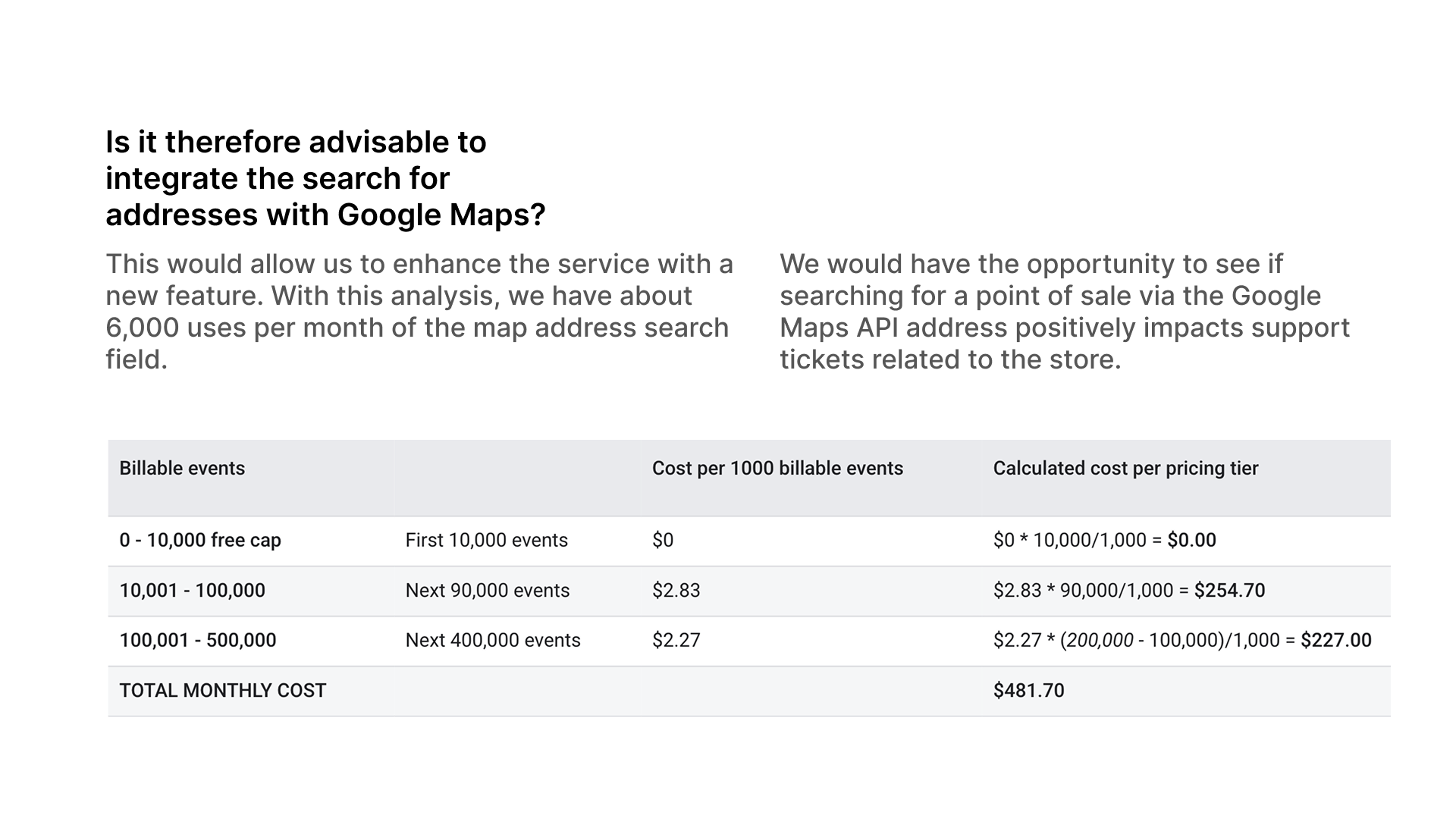
~6,000 monthly address searches suggest that integrating Google Maps address search (estimated cost: $481/month) could improve station discoverability and reduce PV-related tickets — a hypothesis testable post-release with the same tracking infrastructure.
#5 - Proposals
The underlying principle across all three proposals: self-resolution before escalation. Guide the user through recovery steps progressively, surface information at the right moment, reserve the support CTA for when it's truly the last resort.
PROPOSAL 01
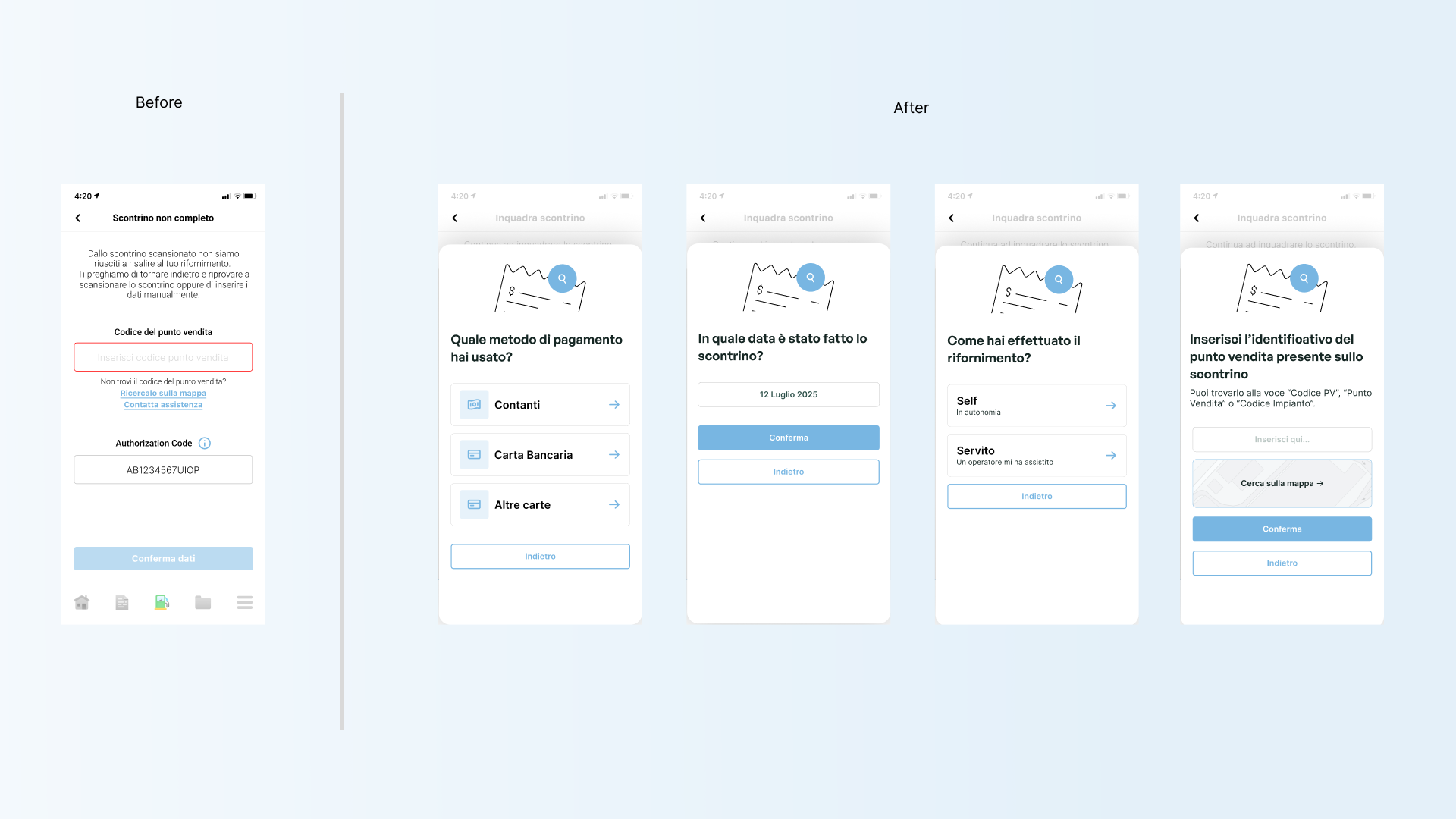
Reduce support CTA visibility at critical failure points
Remove or visually demote "Contatta assistenza" from the primary action hierarchy in error states. Replace it with a structured self-help path. Only surface the support CTA after the user has attempted all self-resolution options.
This doesn't remove access to support — it reorders the choice architecture so that self-resolution is the natural first step, not an alternative to a prominent shortcut.
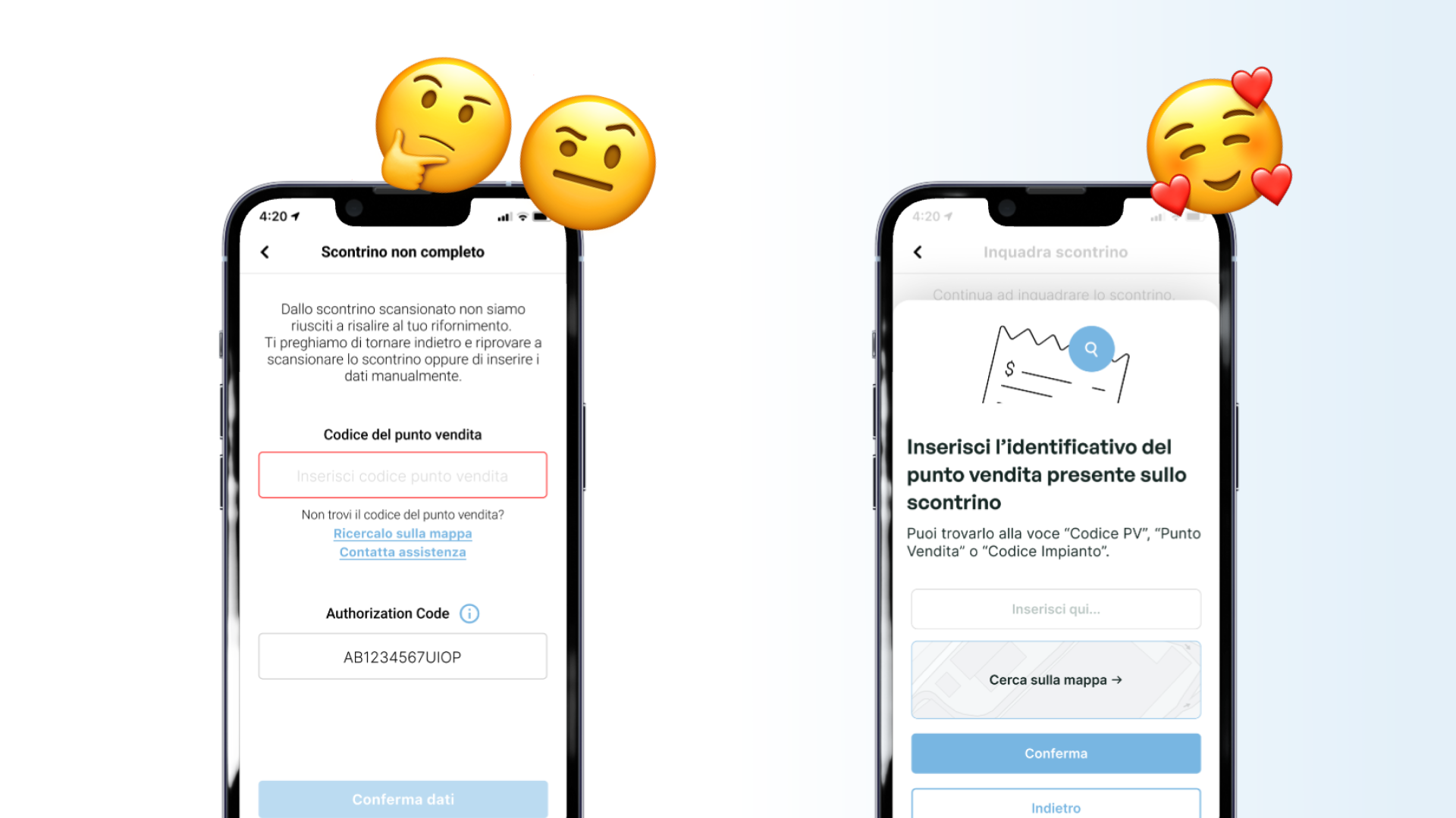
→ [before/after screens qui]
PROPOSAL 02
Progressive disclosure for manual data entry
Break the manual entry form into sequential steps. When a scan fails, show one recovery option at a time — starting with retry scan before presenting manual entry. When manual entry is required, guide the user through each field individually with contextual help, rather than presenting the full form at once.
Error messaging should shift from descriptive ("the code doesn't match any receipt") to directive ("check the 8-digit code printed below the station logo on your receipt").
PROPOSAL 03
Surface station eligibility before the flow begins
Add a visual indicator on the map to distinguish enrolled vs. non-enrolled stations. When a scan points to a non-participating station, surface a clear early-exit message before the user attempts manual entry — explaining that the service isn't available at this location and what their alternatives are.
This eliminates an entire ticket category: users who never could have succeeded, but spent time and patience trying anyway.
→ [before/after screens qui]
#6 - Expected impact
Measurable outcomes, not assumptions
Each proposal targets a specific and quantified source of tickets. Post-implementation, success will be measured against a 30-day baseline using the same behavioral tracking used in this analysis.
Impact items
- Support CTA deprioritization — Target: reduce tickets from the three highest-volume entry points by 30–40%. These three account for 90% of all support-bound sessions.
- Progressive disclosure on manual entry — Target: increase manual entry success rate from 28% to 50%+. This would convert ~660 currently-failing sessions/month into successful invoice submissions.
- Non-participating station filtering — Target: eliminate the "impianto non aderente" ticket category entirely. This category alone was 33% of all tickets and 890–1,780 minutes of support time in 10 days.
- Primary metric — Overall ticket volume reduction target: 40–55% within 60 days of release.
The instinct when users struggle is to make help easier to find. This project showed the opposite can be true: when support is the path of least resistance, users take it — even when they could have solved the problem themselves. Good error design isn't about explaining failure. It's about engineering recovery.
#1 - The core feature wasn't working for 1 in 4 users
Fattura 1 Click is the primary feature of the Eni Station app — it lets drivers request an electronic invoice directly after refueling by scanning their receipt. It's not a secondary feature. It's the reason a significant portion of users download the app.
The support team was receiving a high volume of tickets, but no one had mapped exactly where in the flow users were breaking down, or why. We ran a 10-day behavioral analytics study on ~52,000 active users across iOS and Android to find out whether this was a technical problem, a communication problem, or a design problem.
It turned out to be all three — but mostly design.
Projected monthly, the ~915 tickets in 10 days translate to roughly 2,700 per month — each requiring 5 to 10 minutes of agent time. More importantly, every abandoned flow was a failed product experience for a user who had a legitimate need.
#2 - The drop-off was catastrophic at the first error
The customer journey map showed a clear pattern: the flow functioned well until the receipt scan step. Once a user hit a receipt error, recovery was nearly impossible — not because the app offered no path forward, but because the paths it offered were confusing, incomplete, or led immediately to a support request.
Drop-off chain
- Scan Receipt → 14,900 users (100%)
- Receipt Error — Self Data → 100% hit error state
- Invoice Form Input → 29.8% (4,445 users)
- Invoice Sent → 28% (success)
Of users who tried to manually enter their data after a receipt error, only 28% successfully sent the invoice. The other 72% either hit another error or gave up.
Where support requests originated
- Scontrino non completo → 45% — scan succeeded but data was unresolvable
- Menu (navigated to support directly) → 25% — bypassed the flow entirely
- Scontrino non trovato → 20% — system couldn't locate the receipt at all
#3 - Root causes
The data pointed to three distinct and addressable root causes. Each was generating a disproportionate share of tickets and could be resolved without changing backend logic.
ROOT CAUSE 01
Support was too easy to reach
Data:
- 33.3% of all tickets — impianto non aderente
- 178 tickets in 10 days
- 890–1,780 min total support time consumed
At every critical failure point — receipt scan error, PV not found, authorization code mismatch — the UI prominently displayed a "Contatta assistenza" button. The intent was to help. The effect was to short-circuit any attempt at self-resolution.
Users who hit an error saw three things: a verbose explanation of what went wrong, two links to try to fix it themselves, and a large, visually prominent support CTA. Most clicked the CTA. The self-help options were there — they just weren't being chosen.
The paradox: making support easier to reach was generating more support requests, not fewer. Users weren't asking for help because they needed it — they were asking because the design suggested they should.
ROOT CAUSE 02
Errors explained what happened, not what to do
Data:
- 80% abandoned after the first error
- 28% success rate on manual data entry
- 72% failed again or gave up entirely
When a receipt scan failed, the error screen presented a dense explanation of the technical failure, followed by a form asking users to manually enter their PV code, authorization code, terminal ID, date, time, and amount — all in one screen, with no step-by-step guidance.
Users weren't failing because the task was impossible. They were failing because the interface treated a high-cognitive-load recovery task as if it were self-evident. The form was designed for a user who already understood the system — not for someone in a parking lot, frustrated that their scan didn't work.
The solution wasn't simplification for its own sake — it was progressive disclosure. Show one problem at a time. Guide through each recovery step before moving to the next. Escalate to support only after all self-service options are exhausted.
ROOT CAUSE 03
Non-participating stations weren't filtered upfront
Data:
- 12% of error users tried a non-participating PV
- 47 tickets from PV + AuthCode entry errors
- 235–470 min total support time consumed
A significant share of errors came from users who had legitimately refueled — but at a station not enrolled in Fattura 1 Click. The app had no mechanism to communicate this before they began the flow. They scanned their receipt, got an error, tried manual entry, got another error, and contacted support — only to be told the station wasn't participating.
This is a solvable problem at the entry point, not the error state. The map already shows station locations. Adding a visual indicator for enrolled vs. non-enrolled stations, and surfacing a clear message when a scan points to a non-participating PV, would prevent these users from entering a flow that cannot succeed for them.
#4 - Map insight
The map was being used as a fallback, not a feature.
Stat row
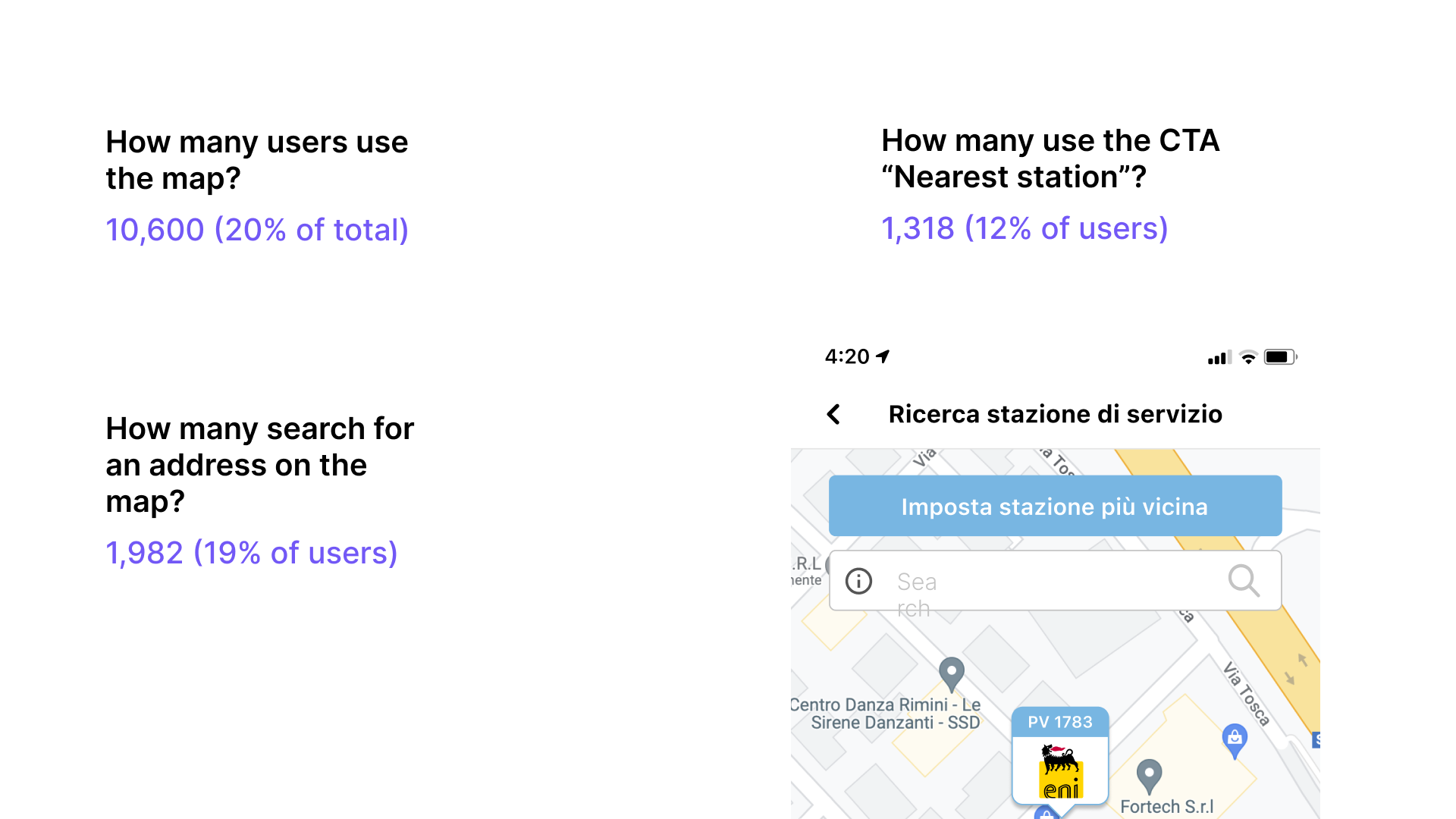
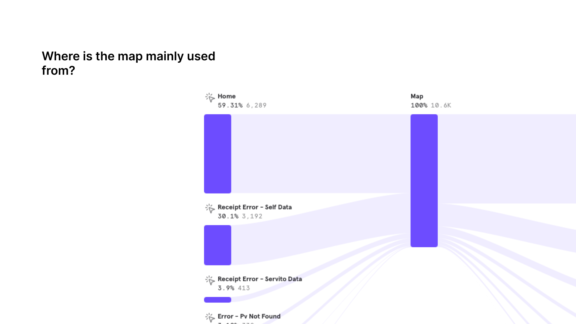
- 59% — of map accesses from Home (expected behavior)
- 30% — came from the Receipt Error — Self Data screen
- 19% — searched for an address
- 12% — used the "Nearest station" CTA
Nearly a third of map sessions were triggered from an error screen — users looking up a PV code after their scan failed. This confirmed that the manual entry flow was unclear enough that users needed to use the map as a reference tool mid-task.
~6,000 monthly address searches suggest that integrating Google Maps address search (estimated cost: $481/month) could improve station discoverability and reduce PV-related tickets — a hypothesis testable post-release with the same tracking infrastructure.
#5 - Proposals
The underlying principle across all three proposals: self-resolution before escalation. Guide the user through recovery steps progressively, surface information at the right moment, reserve the support CTA for when it's truly the last resort.
PROPOSAL 01
Reduce support CTA visibility at critical failure points
Remove or visually demote "Contatta assistenza" from the primary action hierarchy in error states. Replace it with a structured self-help path. Only surface the support CTA after the user has attempted all self-resolution options.
This doesn't remove access to support — it reorders the choice architecture so that self-resolution is the natural first step, not an alternative to a prominent shortcut.
→ [before/after screens qui]
PROPOSAL 02
Progressive disclosure for manual data entry
Break the manual entry form into sequential steps. When a scan fails, show one recovery option at a time — starting with retry scan before presenting manual entry. When manual entry is required, guide the user through each field individually with contextual help, rather than presenting the full form at once.
Error messaging should shift from descriptive ("the code doesn't match any receipt") to directive ("check the 8-digit code printed below the station logo on your receipt").
PROPOSAL 03
Surface station eligibility before the flow begins
Add a visual indicator on the map to distinguish enrolled vs. non-enrolled stations. When a scan points to a non-participating station, surface a clear early-exit message before the user attempts manual entry — explaining that the service isn't available at this location and what their alternatives are.
This eliminates an entire ticket category: users who never could have succeeded, but spent time and patience trying anyway.
→ [before/after screens qui]
#6 - Expected impact
Measurable outcomes, not assumptions
Each proposal targets a specific and quantified source of tickets. Post-implementation, success will be measured against a 30-day baseline using the same behavioral tracking used in this analysis.
Impact items
- Support CTA deprioritization — Target: reduce tickets from the three highest-volume entry points by 30–40%. These three account for 90% of all support-bound sessions.
- Progressive disclosure on manual entry — Target: increase manual entry success rate from 28% to 50%+. This would convert ~660 currently-failing sessions/month into successful invoice submissions.
- Non-participating station filtering — Target: eliminate the "impianto non aderente" ticket category entirely. This category alone was 33% of all tickets and 890–1,780 minutes of support time in 10 days.
- Primary metric — Overall ticket volume reduction target: 40–55% within 60 days of release.
The instinct when users struggle is to make help easier to find. This project showed the opposite can be true: when support is the path of least resistance, users take it — even when they could have solved the problem themselves. Good error design isn't about explaining failure. It's about engineering recovery.
#1 - The core feature wasn't working for 1 in 4 users
Fattura 1 Click is the primary feature of the Eni Station app — it lets drivers request an electronic invoice directly after refueling by scanning their receipt. It's not a secondary feature. It's the reason a significant portion of users download the app.
The support team was receiving a high volume of tickets, but no one had mapped exactly where in the flow users were breaking down, or why. We ran a 10-day behavioral analytics study on ~52,000 active users across iOS and Android to find out whether this was a technical problem, a communication problem, or a design problem.
It turned out to be all three — but mostly design.
Projected monthly, the ~915 tickets in 10 days translate to roughly 2,700 per month — each requiring 5 to 10 minutes of agent time. More importantly, every abandoned flow was a failed product experience for a user who had a legitimate need.
#2 - The drop-off was catastrophic at the first error
The customer journey map showed a clear pattern: the flow functioned well until the receipt scan step. Once a user hit a receipt error, recovery was nearly impossible — not because the app offered no path forward, but because the paths it offered were confusing, incomplete, or led immediately to a support request.
Drop-off chain
- Scan Receipt → 14,900 users (100%)
- Receipt Error — Self Data → 100% hit error state
- Invoice Form Input → 29.8% (4,445 users)
- Invoice Sent → 28% (success)
Of users who tried to manually enter their data after a receipt error, only 28% successfully sent the invoice. The other 72% either hit another error or gave up.
Where support requests originated
- Scontrino non completo → 45% — scan succeeded but data was unresolvable
- Menu (navigated to support directly) → 25% — bypassed the flow entirely
- Scontrino non trovato → 20% — system couldn't locate the receipt at all
#3 - Root causes
The data pointed to three distinct and addressable root causes. Each was generating a disproportionate share of tickets and could be resolved without changing backend logic.
ROOT CAUSE 01
Support was too easy to reach
Data:
- 33.3% of all tickets — impianto non aderente
- 178 tickets in 10 days
- 890–1,780 min total support time consumed
At every critical failure point — receipt scan error, PV not found, authorization code mismatch — the UI prominently displayed a "Contatta assistenza" button. The intent was to help. The effect was to short-circuit any attempt at self-resolution.
Users who hit an error saw three things: a verbose explanation of what went wrong, two links to try to fix it themselves, and a large, visually prominent support CTA. Most clicked the CTA. The self-help options were there — they just weren't being chosen.
The paradox: making support easier to reach was generating more support requests, not fewer. Users weren't asking for help because they needed it — they were asking because the design suggested they should.
ROOT CAUSE 02
Errors explained what happened, not what to do
Data:
- 80% abandoned after the first error
- 28% success rate on manual data entry
- 72% failed again or gave up entirely
When a receipt scan failed, the error screen presented a dense explanation of the technical failure, followed by a form asking users to manually enter their PV code, authorization code, terminal ID, date, time, and amount — all in one screen, with no step-by-step guidance.
Users weren't failing because the task was impossible. They were failing because the interface treated a high-cognitive-load recovery task as if it were self-evident. The form was designed for a user who already understood the system — not for someone in a parking lot, frustrated that their scan didn't work.
The solution wasn't simplification for its own sake — it was progressive disclosure. Show one problem at a time. Guide through each recovery step before moving to the next. Escalate to support only after all self-service options are exhausted.
ROOT CAUSE 03
Non-participating stations weren't filtered upfront
Data:
- 12% of error users tried a non-participating PV
- 47 tickets from PV + AuthCode entry errors
- 235–470 min total support time consumed
A significant share of errors came from users who had legitimately refueled — but at a station not enrolled in Fattura 1 Click. The app had no mechanism to communicate this before they began the flow. They scanned their receipt, got an error, tried manual entry, got another error, and contacted support — only to be told the station wasn't participating.
This is a solvable problem at the entry point, not the error state. The map already shows station locations. Adding a visual indicator for enrolled vs. non-enrolled stations, and surfacing a clear message when a scan points to a non-participating PV, would prevent these users from entering a flow that cannot succeed for them.
#4 - Map insight
The map was being used as a fallback, not a feature.
Stat row
- 59% — of map accesses from Home (expected behavior)
- 30% — came from the Receipt Error — Self Data screen
- 19% — searched for an address
- 12% — used the "Nearest station" CTA
Nearly a third of map sessions were triggered from an error screen — users looking up a PV code after their scan failed. This confirmed that the manual entry flow was unclear enough that users needed to use the map as a reference tool mid-task.
~6,000 monthly address searches suggest that integrating Google Maps address search (estimated cost: $481/month) could improve station discoverability and reduce PV-related tickets — a hypothesis testable post-release with the same tracking infrastructure.
#5 - Proposals
The underlying principle across all three proposals: self-resolution before escalation. Guide the user through recovery steps progressively, surface information at the right moment, reserve the support CTA for when it's truly the last resort.
PROPOSAL 01
Reduce support CTA visibility at critical failure points
Remove or visually demote "Contatta assistenza" from the primary action hierarchy in error states. Replace it with a structured self-help path. Only surface the support CTA after the user has attempted all self-resolution options.
This doesn't remove access to support — it reorders the choice architecture so that self-resolution is the natural first step, not an alternative to a prominent shortcut.
→ [before/after screens qui]
PROPOSAL 02
Progressive disclosure for manual data entry
Break the manual entry form into sequential steps. When a scan fails, show one recovery option at a time — starting with retry scan before presenting manual entry. When manual entry is required, guide the user through each field individually with contextual help, rather than presenting the full form at once.
Error messaging should shift from descriptive ("the code doesn't match any receipt") to directive ("check the 8-digit code printed below the station logo on your receipt").
PROPOSAL 03
Surface station eligibility before the flow begins
Add a visual indicator on the map to distinguish enrolled vs. non-enrolled stations. When a scan points to a non-participating station, surface a clear early-exit message before the user attempts manual entry — explaining that the service isn't available at this location and what their alternatives are.
This eliminates an entire ticket category: users who never could have succeeded, but spent time and patience trying anyway.
→ [before/after screens qui]
#6 - Expected impact
Measurable outcomes, not assumptions
Each proposal targets a specific and quantified source of tickets. Post-implementation, success will be measured against a 30-day baseline using the same behavioral tracking used in this analysis.
Impact items
- Support CTA deprioritization — Target: reduce tickets from the three highest-volume entry points by 30–40%. These three account for 90% of all support-bound sessions.
- Progressive disclosure on manual entry — Target: increase manual entry success rate from 28% to 50%+. This would convert ~660 currently-failing sessions/month into successful invoice submissions.
- Non-participating station filtering — Target: eliminate the "impianto non aderente" ticket category entirely. This category alone was 33% of all tickets and 890–1,780 minutes of support time in 10 days.
- Primary metric — Overall ticket volume reduction target: 40–55% within 60 days of release.
The instinct when users struggle is to make help easier to find. This project showed the opposite can be true: when support is the path of least resistance, users take it — even when they could have solved the problem themselves. Good error design isn't about explaining failure. It's about engineering recovery.