Designing a 5" outdoor touchscreen for first-time EV users
A hardware-constrained UI built for imprecise taps and sunlight, tested in real outdoor conditions.

Project Specifications
This project represents a comprehensive restyling and upgrade, incorporating new features into Fortech S.r.l.'s latest product, the OPT Compact. Designed to enhance the charging experience for electric car users across various scenarios, the goal of this project was to revamp the User Interface and enhance the User Experience for the initial software release.
Duration: 15 June - Ongoing
Significance of the project
The OPT Compact plays a central role in shaping the future of Fortech S.r.l., as it steers the company toward the Electric Car Market dominated by major competitors. Through this compact and innovative solution, the company aims to strengthen its position in the Italian and European market.
About Company
Fortech was set up in 2006 from the synergic collaboration of professionals who had long been working in the field of fuel distribution.
Various giants in the field of petrol distribution have decided to rely on us for the Fortech know-how and professionalism, building solid and long lasting partnerships.
Fortech today is market leader in Italy providing customized solutions to improve business performance of single service stations, fuel retail networks and large petrol companies.
In the last few years, Fortech has also started a process of internationalization, which, thanks to various partnerships, has led it to establish bases in various foreign countries.


Tools:
- Figma
- Notion
- FlowMapp
- Adobe Illustrator
- Adobe Photoshop
- MockView
Roles
- User Experience (UX) Designer
- Interaction (IxD) Designer
- User Interface (UI) Designer
- Visual Designer
Deliverables:
- Analysis current solution
- Personas
- User journeys and task flows
- Sketches
- High-fidelity mockups
- User Flow
- Real world simulation
- Design system and UI kit
- Interaction Motion Design: High-fidelity interactive prototypes
- Usability tests and findings
Research & Discovery
Public chargers have doubled since 2022 to reach more than 5 million
In Europe, the number of public charging points grew more than 35% in 2024 compared to 2023, to reach just over 1 million.
Analyze old Flows and Views
My approach began with learning about the work of the previous designer. In this case, I had the opportunity to interact with a working prototype within the company, which allowed me to learn through hands-on experience. Subsequently, I delved into the design files and conducted a thorough review of the various stages. The initial UI was presented to the end user in the following manner:

What I found out?
When analyzing the previous workflow, I derived several observations. The typography used was excessively small in most views, causing readability issues. Buttons and informational content were not properly arranged, and there were inconsistencies in padding between components. This inconsistency inadvertently conveyed varying levels of importance for different CTAs (Call to Actions). Graphic discontinuity was also present due to the use of simplistic illustrations, which often differed from one another, including some icons within all interfaces.
In some cases, the navigation bar exhibited unnecessary behaviors and was too small for comfortable use with fingers. Additionally, the lack of adequate padding in the components significantly increased the risk of accidental clicks or missed clicks, resulting in users having to repeat actions unnecessarily.

Why is the product at risk of being limiting?
The display is smartphone-sized (5.4 " - like iPhone 12 Mini), but its use necessitates a physical distance from the terminal. This leads to reduced accuracy when performing actions or touches on the terminal, consequently increasing the likelihood of user errors. When the device makes mistakes, it causes discomfort for the user.


During a simulation of usage in a controlled environment, the risk of failure of such a small user interface in situations like the following became immediately apparent.

This behavior is not accepted on smartphone and even on this device.
Why Persona is so different?
After carefully analyzing the existing flows, I began to question whether the interface had truly been designed with a specific user persona in mind or if certain design aspects had been overlooked. This process was beneficial in helping me reorient myself toward a better understanding of who my actual user was. It led to a reevaluation of some fundamental concepts related to on-site software application usage.

The user persona of an electric car owner may differ from that of other users because there are some specific characteristics and needs associated with the management and use of an electric vehicle. Here are some reasons why the user persona of an electric car owner may be different:
- Charging Needs: An electric car owner must plan and manage the vehicle's charging. This may involve the need to find charging stations, plan routes based on the availability of charging stations, and consider charging times during trips.
- Costs and Incentives: Managing an electric car can involve different costs compared to a traditional car. Users may benefit from tax incentives or charging discounts, but they must also consider the higher initial costs of purchasing an electric vehicle.
- Sustainability and Environment: Many people choose to switch to electric vehicles for environmental reasons. This can influence their purchasing decisions and preferences for environmentally sustainable products and services.
- Technology and Apps: Electric car users may be more interested in technology and apps that facilitate charging management, energy consumption monitoring, and trip planning.
- Energy Savings: Electric car owners may be more focused on energy savings and efficiency, closely monitoring their vehicle's energy consumption and adopting behaviors to optimize it.
- Community and Experience Sharing: Electric car users often join online communities or local groups to share experiences, charging information, and maintenance tips.
In summary, the user persona of an electric car owner may differ from other users because their needs, concerns, and behaviors are influenced by the specific nature of electric vehicles and the challenges and opportunities associated with their management. This can be important for companies and service providers looking to create products and services tailored to this user group.
Design process
Sketches
From the initial sketches, I made the deliberate choice to provide ample space for the elements, allowing them to breathe within a compact container, such as the OPT Compact. The decision to hide secondary-use elements was carefully made to streamline the UI and prevent any potential disruptions to the user experience.

User Flow
With the introduction of a new home screen behavior, it became necessary to readjust all other aspects of the flow. As a result, the User Flow design placed particular emphasis on incorporating the various micro-interactions that were added to enhance the overall user experience.

Design evolution
During the stages of creating the user interface, I designed several variations of the home screen. These variants were developed in response to the company's request to maintain the versatility of the terminal, allowing it to function not only as an electric charging station but also as a platform for additional services. To achieve this, it was necessary to evolve the interface in preparation for a future update.


Design System
The design system was created with careful consideration of all aspects essential for a small device like the OPT Compact. This included using thick typography to ensure legibility even in brightly lit environments, adopting color palettes in line with current trends in the electric market (Electric Violet), and implementing prominent padding to enable users to achieve the desired results even with imprecise clicks.


Why I used the Motion Design
The small size of the device imposes limitations on user interaction. I came to this realization after actively using the initial version proposed by the previous designers. This insight led me to develop a solution that could both visually explain concepts and reduce font size in the typography across all views. Consequently, I introduced the use of Motion Design within the interface to enhance user interactions with the device.
To aid in locating hidden components and enhance the overall user experience while adhering to Hick's Law, I integrated motion to encourage secondary actions and emphasize the primary navigation.

Testing
Outside testing
The primary application of the device will be outdoors in electric vehicle charging zones. This introduces numerous complexities, beginning with the product itself, which is being built through outsourcing, and extending to the user interfaces (UIs). To address these challenges, I created multiple screens and tested them on an actual device placed outdoors. This allowed me to ensure that contrasts, colors, shapes, and typography were effectively communicated and suitable for outdoor usage.

Usability Testing
I reused a script and repurposed it to follow the user in testing various streams (primary and secondary). I tried as much as possible to make the context as real as possible. The tests were conducted in a charging environment located within the Fortech company. Interfaces were used through a prototype created through Figma.

I tried where possible to inform the user of the device's incomplete functionality. Many errors that clutched the experience were due to the prototype, others from usability and design errors. I purposely did not inform the user of which ones they found so as not to falsify the test too much.


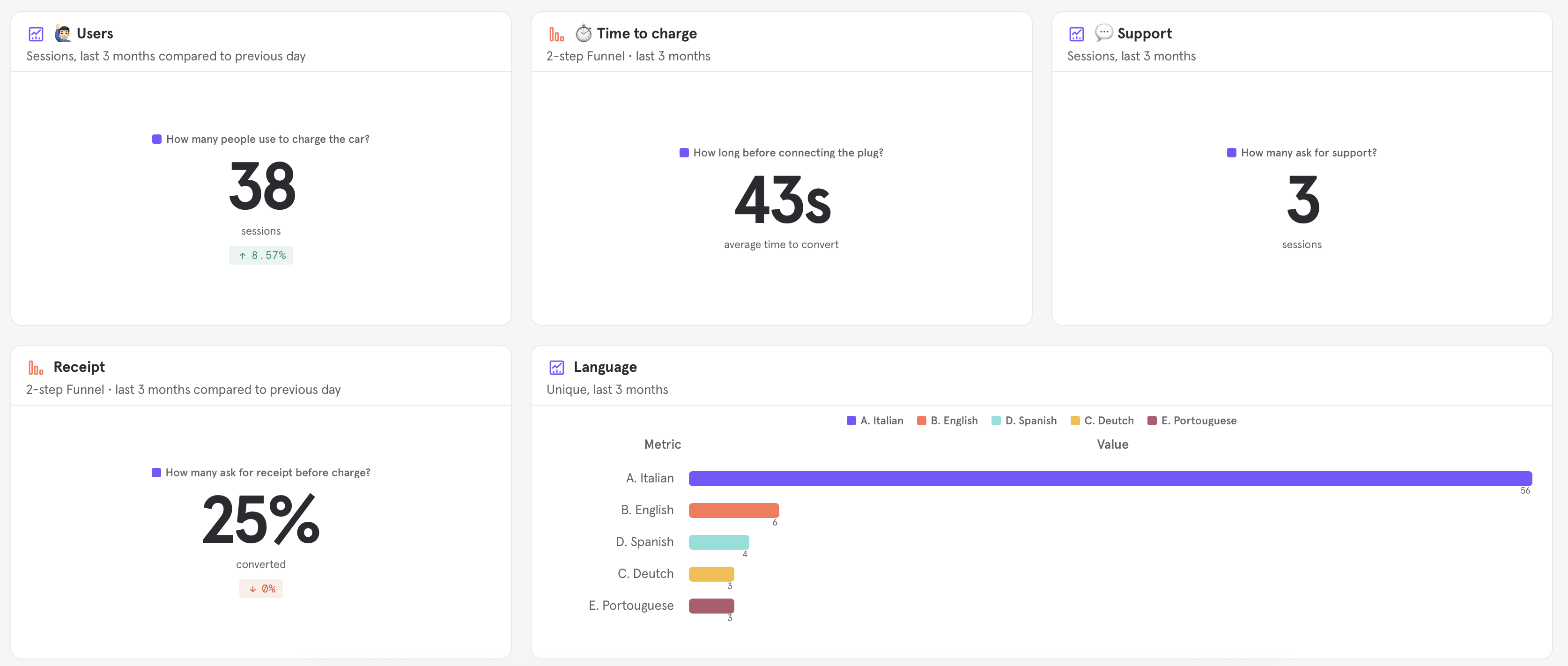
In the process of refining my UX design skills, I leveraged Notion as a powerful tool to delve into the qualitative insights extracted from the rewatch of two critical usability tests. Notion provided me with a dynamic platform to meticulously organize, analyze, and distill the wealth of information gathered during these tests. This approach not only allowed me to pinpoint areas for improvement but also enabled me to foster a deeper understanding of user behavior and preferences. With Notion as my ally, I was able to concentrate on the qualitative nuances that have proven instrumental in enhancing my design thinking and decision-making processes.

Affinity Diagram
I reorganized the information by creating an affinity diagram, a methodical approach that allowed me to categorize and connect related insights with precision. The affinity diagram became a visual representation of the complex interplay of qualitative data. It enabled me to identify recurring themes, similarities, and discrepancies in user feedback, providing a structured framework for deeper analysis. This approach not only uncovered valuable insights but also laid the foundation for informed design decisions, ensuring that the user experience was thoughtfully optimized.

Customer Journey Map
The customer journey map played a crucial role. It brought attention to something the company had never considered: electric users don't have the same habits as those at a gas station, where they exit the car and approach a cabinet to initiate the charging process. Instead, they use the app or the car itself to trigger it. This represents a significant shift in user behavior within this market, leading to substantial friction. In addition to this, the map highlighted that some features and component utilization were incorrect or completely hindered the platform's functionality.

Improvements after the tests
Certain elements, like the numeric keypad, served a dual purpose for entering the credit card PIN and the telephone number when requesting a receipt. The information input process lacked consistency and caused users to make errors, as they often entered their card PIN instead of the telephone number. This situation prompted me to enhance communication at the top by incorporating icons and giving greater prominence to the accompanying text.


Research & Discovery
Public chargers have doubled since 2022 to reach more than 5 million
In Europe, the number of public charging points grew more than 35% in 2024 compared to 2023, to reach just over 1 million.
Analyze old Flows and Views
My approach began with learning about the work of the previous designer. In this case, I had the opportunity to interact with a working prototype within the company, which allowed me to learn through hands-on experience. Subsequently, I delved into the design files and conducted a thorough review of the various stages. The initial UI was presented to the end user in the following manner:
What I found out?
When analyzing the previous workflow, I derived several observations. The typography used was excessively small in most views, causing readability issues. Buttons and informational content were not properly arranged, and there were inconsistencies in padding between components. This inconsistency inadvertently conveyed varying levels of importance for different CTAs (Call to Actions). Graphic discontinuity was also present due to the use of simplistic illustrations, which often differed from one another, including some icons within all interfaces.
In some cases, the navigation bar exhibited unnecessary behaviors and was too small for comfortable use with fingers. Additionally, the lack of adequate padding in the components significantly increased the risk of accidental clicks or missed clicks, resulting in users having to repeat actions unnecessarily.
Why is the product at risk of being limiting?
The display is smartphone-sized (5.4 " - like iPhone 12 Mini), but its use necessitates a physical distance from the terminal. This leads to reduced accuracy when performing actions or touches on the terminal, consequently increasing the likelihood of user errors. When the device makes mistakes, it causes discomfort for the user.
During a simulation of usage in a controlled environment, the risk of failure of such a small user interface in situations like the following became immediately apparent.
This behavior is not accepted on smartphone and even on this device.
Why Persona is so different?
After carefully analyzing the existing flows, I began to question whether the interface had truly been designed with a specific user persona in mind or if certain design aspects had been overlooked. This process was beneficial in helping me reorient myself toward a better understanding of who my actual user was. It led to a reevaluation of some fundamental concepts related to on-site software application usage.
The user persona of an electric car owner may differ from that of other users because there are some specific characteristics and needs associated with the management and use of an electric vehicle. Here are some reasons why the user persona of an electric car owner may be different:
- Charging Needs: An electric car owner must plan and manage the vehicle's charging. This may involve the need to find charging stations, plan routes based on the availability of charging stations, and consider charging times during trips.
- Costs and Incentives: Managing an electric car can involve different costs compared to a traditional car. Users may benefit from tax incentives or charging discounts, but they must also consider the higher initial costs of purchasing an electric vehicle.
- Sustainability and Environment: Many people choose to switch to electric vehicles for environmental reasons. This can influence their purchasing decisions and preferences for environmentally sustainable products and services.
- Technology and Apps: Electric car users may be more interested in technology and apps that facilitate charging management, energy consumption monitoring, and trip planning.
- Energy Savings: Electric car owners may be more focused on energy savings and efficiency, closely monitoring their vehicle's energy consumption and adopting behaviors to optimize it.
- Community and Experience Sharing: Electric car users often join online communities or local groups to share experiences, charging information, and maintenance tips.
In summary, the user persona of an electric car owner may differ from other users because their needs, concerns, and behaviors are influenced by the specific nature of electric vehicles and the challenges and opportunities associated with their management. This can be important for companies and service providers looking to create products and services tailored to this user group.
Design process
Sketches
From the initial sketches, I made the deliberate choice to provide ample space for the elements, allowing them to breathe within a compact container, such as the OPT Compact. The decision to hide secondary-use elements was carefully made to streamline the UI and prevent any potential disruptions to the user experience.
User Flow
With the introduction of a new home screen behavior, it became necessary to readjust all other aspects of the flow. As a result, the User Flow design placed particular emphasis on incorporating the various micro-interactions that were added to enhance the overall user experience.
Design evolution
During the stages of creating the user interface, I designed several variations of the home screen. These variants were developed in response to the company's request to maintain the versatility of the terminal, allowing it to function not only as an electric charging station but also as a platform for additional services. To achieve this, it was necessary to evolve the interface in preparation for a future update.
Design System
The design system was created with careful consideration of all aspects essential for a small device like the OPT Compact. This included using thick typography to ensure legibility even in brightly lit environments, adopting color palettes in line with current trends in the electric market (Electric Violet), and implementing prominent padding to enable users to achieve the desired results even with imprecise clicks.
Why I used the Motion Design
The small size of the device imposes limitations on user interaction. I came to this realization after actively using the initial version proposed by the previous designers. This insight led me to develop a solution that could both visually explain concepts and reduce font size in the typography across all views. Consequently, I introduced the use of Motion Design within the interface to enhance user interactions with the device.
To aid in locating hidden components and enhance the overall user experience while adhering to Hick's Law, I integrated motion to encourage secondary actions and emphasize the primary navigation.
Testing
Outside testing
The primary application of the device will be outdoors in electric vehicle charging zones. This introduces numerous complexities, beginning with the product itself, which is being built through outsourcing, and extending to the user interfaces (UIs). To address these challenges, I created multiple screens and tested them on an actual device placed outdoors. This allowed me to ensure that contrasts, colors, shapes, and typography were effectively communicated and suitable for outdoor usage.
Usability Testing
I reused a script and repurposed it to follow the user in testing various streams (primary and secondary). I tried as much as possible to make the context as real as possible. The tests were conducted in a charging environment located within the Fortech company. Interfaces were used through a prototype created through Figma.
I tried where possible to inform the user of the device's incomplete functionality. Many errors that clutched the experience were due to the prototype, others from usability and design errors. I purposely did not inform the user of which ones they found so as not to falsify the test too much.
In the process of refining my UX design skills, I leveraged Notion as a powerful tool to delve into the qualitative insights extracted from the rewatch of two critical usability tests. Notion provided me with a dynamic platform to meticulously organize, analyze, and distill the wealth of information gathered during these tests. This approach not only allowed me to pinpoint areas for improvement but also enabled me to foster a deeper understanding of user behavior and preferences. With Notion as my ally, I was able to concentrate on the qualitative nuances that have proven instrumental in enhancing my design thinking and decision-making processes.
Affinity Diagram
I reorganized the information by creating an affinity diagram, a methodical approach that allowed me to categorize and connect related insights with precision. The affinity diagram became a visual representation of the complex interplay of qualitative data. It enabled me to identify recurring themes, similarities, and discrepancies in user feedback, providing a structured framework for deeper analysis. This approach not only uncovered valuable insights but also laid the foundation for informed design decisions, ensuring that the user experience was thoughtfully optimized.
Customer Journey Map
The customer journey map played a crucial role. It brought attention to something the company had never considered: electric users don't have the same habits as those at a gas station, where they exit the car and approach a cabinet to initiate the charging process. Instead, they use the app or the car itself to trigger it. This represents a significant shift in user behavior within this market, leading to substantial friction. In addition to this, the map highlighted that some features and component utilization were incorrect or completely hindered the platform's functionality.
Improvements after the tests
Certain elements, like the numeric keypad, served a dual purpose for entering the credit card PIN and the telephone number when requesting a receipt. The information input process lacked consistency and caused users to make errors, as they often entered their card PIN instead of the telephone number. This situation prompted me to enhance communication at the top by incorporating icons and giving greater prominence to the accompanying text.
Problems
While creating the payment views, I encountered a technical challenge due to the integration of a third-party payment technology by the company. Although this technology offered enhanced security and affordability, it had limitations in terms of code and element customization, resulting in inconsistency within the User Interface. Despite this, I managed to design the payment screen to maintain a high-quality UI. During development, I had to adapt to the company's chosen solution.

How did I value the project?
Physical Illustrations
In a digital world dominated by screens and pixels, I understand the significance of incorporating physicality into UI design, especially when dealing with applications intended for outdoor environments. The decision to embrace physical elements in user interface illustrations is driven by a deep appreciation for the real-world context in which users interact with these interfaces. By introducing tactile and tangible elements, we bridge the gap between the digital and physical realms, providing users with a more intuitive and immersive experience. This design approach not only enhances usability but also ensures that users can effortlessly navigate the application, even when exposed to the elements. By making this deliberate choice, I aim to create a seamless and user-centric experience, where the interface design not only complements the outdoor environment but also enhances the user's connection to the technology, making it more accessible and engaging.
More with less
To expedite navigation while requesting a receipt or during an interruption in the recharge process, I believed that presenting the same credit card used for the initial transaction would be an effective way to directly associate the user and retrieve associated information (such as plug and column details). This method allowed us to standardize the initial phase of these two features.
Customization
As long as the project was in design, the direction was changing for the customizations of the interface. I decided to apply a gradient link to the logo of the company to allow the developers adapt the variables from the code. This solution helps them to easily implement the full flow customization requirements (Logo + Colors).
.png)
Continuity
During the testing phase, it became evident that the manner in which I grouped "services" under a hidden screen was not effective in conveying to the user that they might find what they were looking for there. This issue was attributed to problems with both the wording and the organization of the elements.
.gif)
What I learned?
Progressive Disclosure: use it but not too.
During the testing phase, it became evident that the manner in which I grouped "services" under a hidden screen was not effective in conveying to the user that they might find what they were looking for there. This issue was attributed to problems with both the wording and the organization of the elements.

Research & Discovery
Public chargers have doubled since 2022 to reach more than 5 million
In Europe, the number of public charging points grew more than 35% in 2024 compared to 2023, to reach just over 1 million.
Analyze old Flows and Views
My approach began with learning about the work of the previous designer. In this case, I had the opportunity to interact with a working prototype within the company, which allowed me to learn through hands-on experience. Subsequently, I delved into the design files and conducted a thorough review of the various stages. The initial UI was presented to the end user in the following manner:
What I found out?
When analyzing the previous workflow, I derived several observations. The typography used was excessively small in most views, causing readability issues. Buttons and informational content were not properly arranged, and there were inconsistencies in padding between components. This inconsistency inadvertently conveyed varying levels of importance for different CTAs (Call to Actions). Graphic discontinuity was also present due to the use of simplistic illustrations, which often differed from one another, including some icons within all interfaces.
In some cases, the navigation bar exhibited unnecessary behaviors and was too small for comfortable use with fingers. Additionally, the lack of adequate padding in the components significantly increased the risk of accidental clicks or missed clicks, resulting in users having to repeat actions unnecessarily.
Why is the product at risk of being limiting?
The display is smartphone-sized (5.4 " - like iPhone 12 Mini), but its use necessitates a physical distance from the terminal. This leads to reduced accuracy when performing actions or touches on the terminal, consequently increasing the likelihood of user errors. When the device makes mistakes, it causes discomfort for the user.
During a simulation of usage in a controlled environment, the risk of failure of such a small user interface in situations like the following became immediately apparent.
This behavior is not accepted on smartphone and even on this device.
Why Persona is so different?
After carefully analyzing the existing flows, I began to question whether the interface had truly been designed with a specific user persona in mind or if certain design aspects had been overlooked. This process was beneficial in helping me reorient myself toward a better understanding of who my actual user was. It led to a reevaluation of some fundamental concepts related to on-site software application usage.
The user persona of an electric car owner may differ from that of other users because there are some specific characteristics and needs associated with the management and use of an electric vehicle. Here are some reasons why the user persona of an electric car owner may be different:
- Charging Needs: An electric car owner must plan and manage the vehicle's charging. This may involve the need to find charging stations, plan routes based on the availability of charging stations, and consider charging times during trips.
- Costs and Incentives: Managing an electric car can involve different costs compared to a traditional car. Users may benefit from tax incentives or charging discounts, but they must also consider the higher initial costs of purchasing an electric vehicle.
- Sustainability and Environment: Many people choose to switch to electric vehicles for environmental reasons. This can influence their purchasing decisions and preferences for environmentally sustainable products and services.
- Technology and Apps: Electric car users may be more interested in technology and apps that facilitate charging management, energy consumption monitoring, and trip planning.
- Energy Savings: Electric car owners may be more focused on energy savings and efficiency, closely monitoring their vehicle's energy consumption and adopting behaviors to optimize it.
- Community and Experience Sharing: Electric car users often join online communities or local groups to share experiences, charging information, and maintenance tips.
In summary, the user persona of an electric car owner may differ from other users because their needs, concerns, and behaviors are influenced by the specific nature of electric vehicles and the challenges and opportunities associated with their management. This can be important for companies and service providers looking to create products and services tailored to this user group.
Design process
Sketches
From the initial sketches, I made the deliberate choice to provide ample space for the elements, allowing them to breathe within a compact container, such as the OPT Compact. The decision to hide secondary-use elements was carefully made to streamline the UI and prevent any potential disruptions to the user experience.
User Flow
With the introduction of a new home screen behavior, it became necessary to readjust all other aspects of the flow. As a result, the User Flow design placed particular emphasis on incorporating the various micro-interactions that were added to enhance the overall user experience.
Design evolution
During the stages of creating the user interface, I designed several variations of the home screen. These variants were developed in response to the company's request to maintain the versatility of the terminal, allowing it to function not only as an electric charging station but also as a platform for additional services. To achieve this, it was necessary to evolve the interface in preparation for a future update.
Design System
The design system was created with careful consideration of all aspects essential for a small device like the OPT Compact. This included using thick typography to ensure legibility even in brightly lit environments, adopting color palettes in line with current trends in the electric market (Electric Violet), and implementing prominent padding to enable users to achieve the desired results even with imprecise clicks.
Why I used the Motion Design
The small size of the device imposes limitations on user interaction. I came to this realization after actively using the initial version proposed by the previous designers. This insight led me to develop a solution that could both visually explain concepts and reduce font size in the typography across all views. Consequently, I introduced the use of Motion Design within the interface to enhance user interactions with the device.
To aid in locating hidden components and enhance the overall user experience while adhering to Hick's Law, I integrated motion to encourage secondary actions and emphasize the primary navigation.
Testing
Outside testing
The primary application of the device will be outdoors in electric vehicle charging zones. This introduces numerous complexities, beginning with the product itself, which is being built through outsourcing, and extending to the user interfaces (UIs). To address these challenges, I created multiple screens and tested them on an actual device placed outdoors. This allowed me to ensure that contrasts, colors, shapes, and typography were effectively communicated and suitable for outdoor usage.
Usability Testing
I reused a script and repurposed it to follow the user in testing various streams (primary and secondary). I tried as much as possible to make the context as real as possible. The tests were conducted in a charging environment located within the Fortech company. Interfaces were used through a prototype created through Figma.
I tried where possible to inform the user of the device's incomplete functionality. Many errors that clutched the experience were due to the prototype, others from usability and design errors. I purposely did not inform the user of which ones they found so as not to falsify the test too much.
In the process of refining my UX design skills, I leveraged Notion as a powerful tool to delve into the qualitative insights extracted from the rewatch of two critical usability tests. Notion provided me with a dynamic platform to meticulously organize, analyze, and distill the wealth of information gathered during these tests. This approach not only allowed me to pinpoint areas for improvement but also enabled me to foster a deeper understanding of user behavior and preferences. With Notion as my ally, I was able to concentrate on the qualitative nuances that have proven instrumental in enhancing my design thinking and decision-making processes.
Affinity Diagram
I reorganized the information by creating an affinity diagram, a methodical approach that allowed me to categorize and connect related insights with precision. The affinity diagram became a visual representation of the complex interplay of qualitative data. It enabled me to identify recurring themes, similarities, and discrepancies in user feedback, providing a structured framework for deeper analysis. This approach not only uncovered valuable insights but also laid the foundation for informed design decisions, ensuring that the user experience was thoughtfully optimized.
Customer Journey Map
The customer journey map played a crucial role. It brought attention to something the company had never considered: electric users don't have the same habits as those at a gas station, where they exit the car and approach a cabinet to initiate the charging process. Instead, they use the app or the car itself to trigger it. This represents a significant shift in user behavior within this market, leading to substantial friction. In addition to this, the map highlighted that some features and component utilization were incorrect or completely hindered the platform's functionality.
Improvements after the tests
Certain elements, like the numeric keypad, served a dual purpose for entering the credit card PIN and the telephone number when requesting a receipt. The information input process lacked consistency and caused users to make errors, as they often entered their card PIN instead of the telephone number. This situation prompted me to enhance communication at the top by incorporating icons and giving greater prominence to the accompanying text.